JumpCharge
A wireless charging battery pack that lets the user charge all of their devices. The app lets users rent a battery, keep track of their paid time, and customize their notifications.
My Role
I worked as the lead designer alongside the JumpCharge team to improve the UX experience and design of the JumpCharge app. I began this project by researching to gain a better understanding of the current industry and design standards. I then worked to improve the workflow within the app and I then moved to the design phase. I met with both the UX manager and JumpCharge team through the entire process to ensure all the product needs were being met.
Objective
Improve the JumpCharge experience
The goal of redesigning the JumpCharge app is to improve the overall UX and UI experience. This can be accomplished by rethinking the following:
Opportunity to improve screen flow and app organization
Opportunity to condense app where we can (ex. account page)
Bring app up to speed with current design trends - app currently feels outdated
Better align the app with the look and feel of the kiosk so it feels like one cohesive unit
Challenges
There are a number of challenges when redesigning the JumpCharge app:
The app features are fairly unique
App baseline design already exists
JumpCharge brand is continuing to grow i.e. kiosk design is still in progress
Growing feature set and timelines are not finalized
Strategy
Redesigning the JumpCharge App
The strategy for redesigning the JumpCharge app is to build a baseline of the new app design that will influence each screen.
Research phase and research document
Review current app screens and note where app can be condensed and better organized.
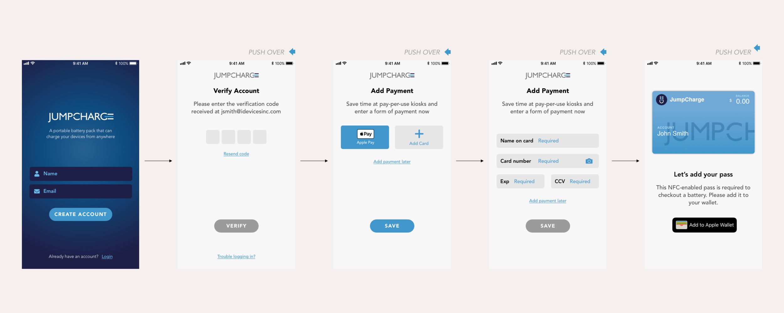
Build out current and new app workflows to improve the UX experience
Create a design baseline that will influence each screen.
Create mockups with updated app design and elements
Update app screens based on the updated design baseline.
Redesign app based on research and mockups
Create a modern and bold app that will appeal to the target audience.
Handoff app screens for development
Outcome
The overall UI and UX experience have been improved by redesigning the JumpCharge app. Steps that have been taken to ensure this are:
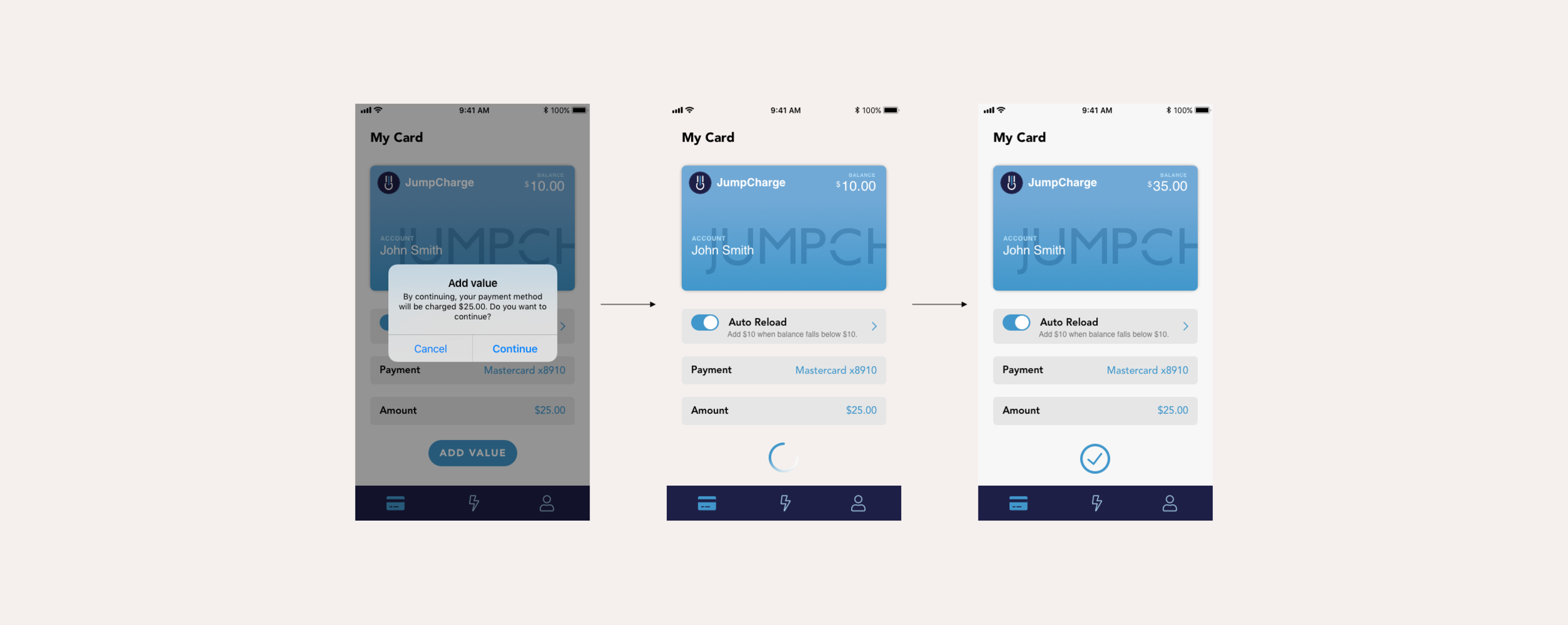
The app screen flow and organization have been updated to feel more cohesive.
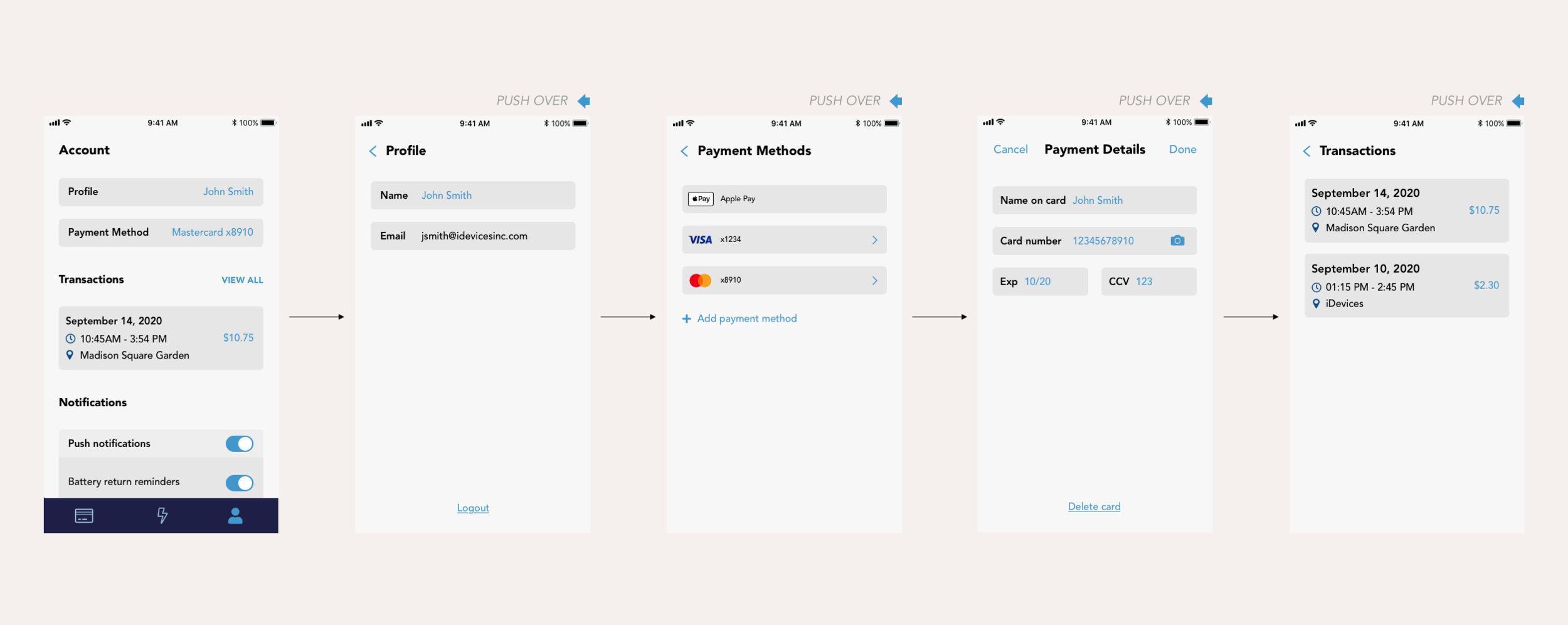
App screens have been condensed. For example the account screen hosts the profile, payment methods, transaction history, and notification options.
UI improvements have been made to the navigation and to the overall look and feel of the app.
There is a stronger use of the JumpCharge blue and the app has a modernized look.


