iDevices Connected
A smart home app that lets you control all iDevices and HomeKit enabled products. Users can customize their home, create schedules, triggers, scenes, and monitor their energy usage.
My Role
My goal was to improve the UX experience and design of the energy reporting screens within the iDevices Connected app. I did this through research, exploration and design phases. I presented my findings and work to both the UX team lead and the manager of the UX team.
Objective
Improve the UI on the Energy Reporting screens so the information is easier for the user to understand.
The previous design made it difficult for the user to understand how much energy each product was using.
It was also confusing for the user to understand their home’s energy consumption as a whole.
This was discovered through UX analytics and direct consumer feedback.
Challenges
Updating the UI on a screen the users are already familiar and comfortable with:
How can the UI be improved while keeping the screens on brand with the rest of the iDevices Connected app?
Can additional information be added to the app that would be useful to the user?
Process
Research how other apps and websites are handling a similar experience.
Look at our user feedback and app analytics to further understand user pain points.
Research competitor products and their user feedback to further understand the industries standard and find opportunity for improvements.
Explore different design options within our own app branding.
Test out different energy reporting features that may bring additional value to the energy reporting screens.
Explorations


Solution
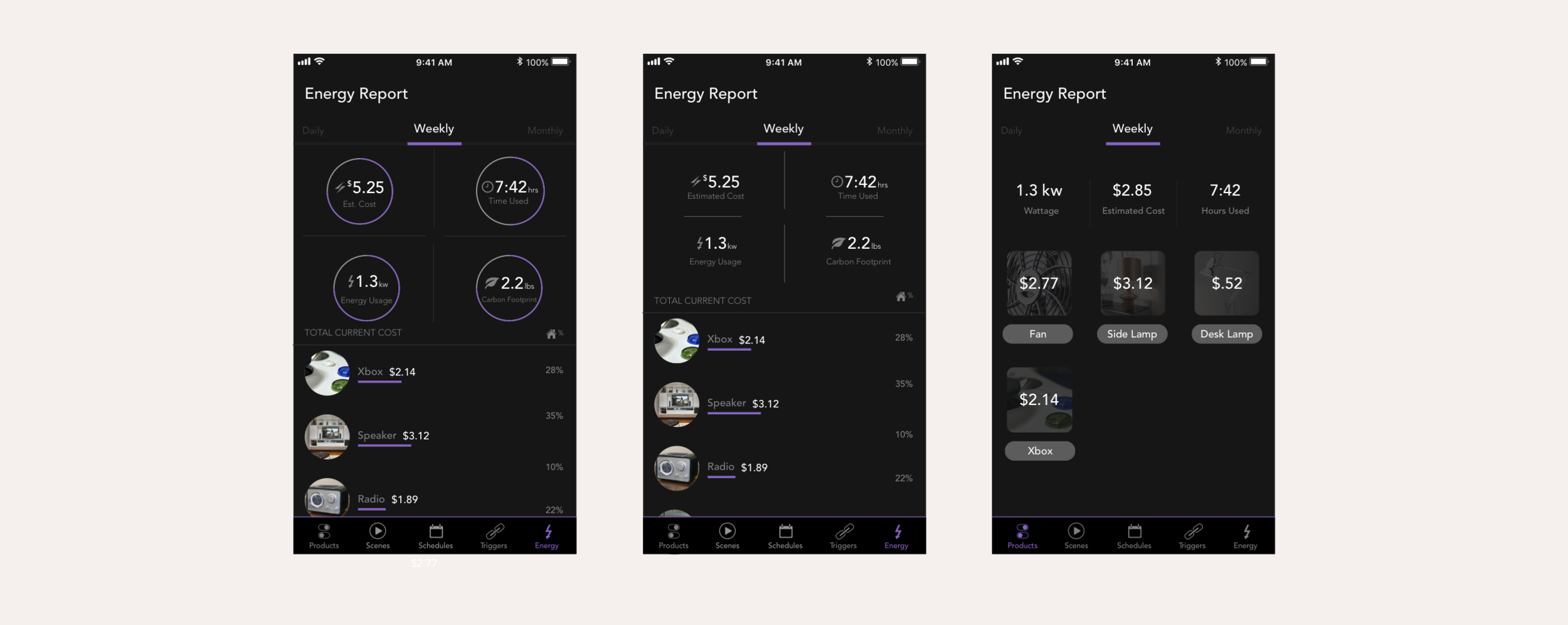
Full home view
Removed the image of the users home and the name of the home. This allowed there to be additional room on the screen for information and it removed the need for extra scrolling. Cleaned up the layout that shows the user their wattage, estimated cost, and hours used for daily, weekly, monthly, yearly, and all time views. Brought in the product name and paired it with the products photo. Enhanced the current cost. Scaled the sizing up to help improve readability. The entire screen was given a more modernized design; this can be seen in the colors. This allowed each product to feel easily digestible.
Product detailed view
The product photo and name were combined to feel more like a header. This allowed product view across all 3 screens to remain the same. This is very important for the users understanding of the information. The energy consumption graph was scaled up. The products energy consumption graph and the entire houses energy consumption graph has been combined. This made it very quick and easy to see how much energy one product is consuming. For example, a user can quickly see that a product is using 75% of the entire homes energy consumption. The daily, weekly, monthly, yearly, and all time views have been cleaned up. The circles around the icons had been removed and this helped the information feel more digestible and less heavy. The text colors have been changed to put emphasis on the power used, estimated cost, and time used because this was more valuable than the title.
Product view
The graph on the detailed product view screen is the same graph that was brought into the product view screens. The user is more familiar with this graph and will find the information easier to understand at a glance. This graph saw the same changes that the graph on the Product Detailed View screen has seen.
Outcome
The UI changes made to the energy reporting screen improved the UI as well as the user experience.
The screens feel and function as one cohesive unit.
The information is displayed the same way across each screen. This helps the user understand the information with confidence.
The design is more modern while also maintaining the brand and integrity of the app.


